
Colour is the quiet engine of a capsule wardrobe. When your colours agree with each other, almost everything you own goes together. When they do not, you end up with a full closet and still nothing to wear.
This guide explains how to choose neutral capsule wardrobe colors, how to add accents without chaos, and how to match colours to your skin tone, your lifestyle and your laundry reality. It uses five ready-made palettes, so you can pick one and start.
What neutrals really are
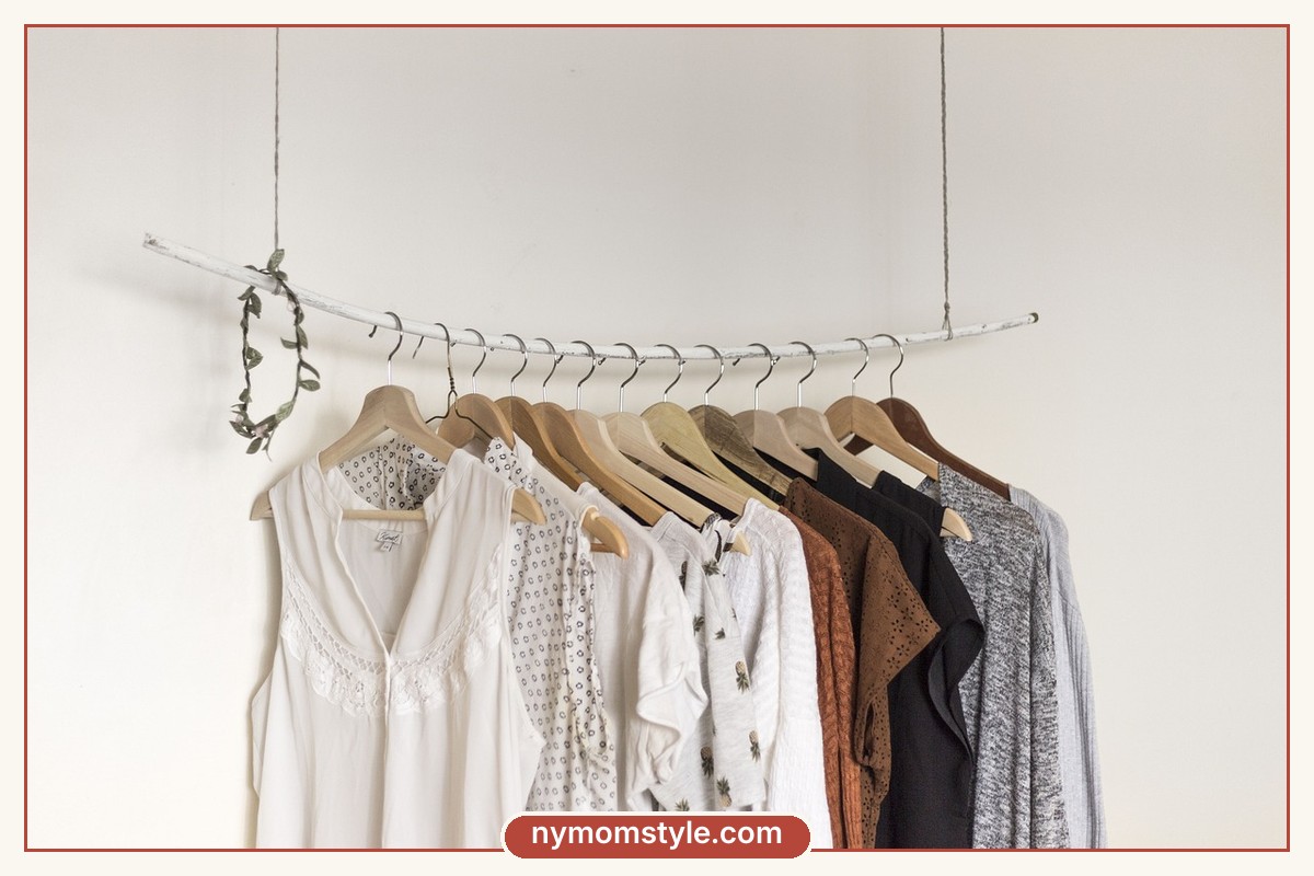
Neutral colours are shades that pair easily with many others. Black, white, grey, navy, beige, cream, camel and brown are the common ones. If you want a short overview, read the Wikipedia page on neutral colours. Olive and denim blue also work as neutrals in many wardrobes.
A neutral is not the same as boring. A cream knit, a camel coat and a navy jacket have plenty of depth when the fabrics and textures are interesting.
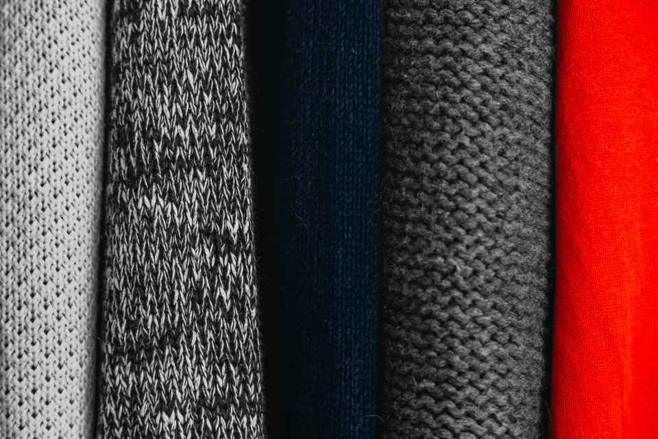
The 60-30-10 rule for a capsule palette
A simple way to balance colour is the 60-30-10 rule:
- 60 percent main neutral: the colour of most of your bottoms and outerwear, such as navy or black.
- 30 percent secondary neutral: the colour of many tops and layers, such as cream, grey or camel.
- 10 percent accent: the colour that makes you smile, such as rust, olive, blush or a bold stripe.
You do not have to follow the numbers exactly. They just remind you that most of the closet should be quiet, and one colour can speak.
Five palettes to choose from
| Palette | Main neutral | Secondary neutral | Accent | Mood |
|---|---|---|---|---|
| Classic | Navy | Cream | Camel or red | Smart, timeless |
| Soft and warm | Camel | Cream | Rust or olive | Cosy, earthy |
| City black | Black | Grey | White and a bold lip or bag | Sleek, New York feel |
| Fresh and light | Denim blue | White | Blush or sage | Bright, casual |
| Earth tones | Olive | Tan | Terracotta | Relaxed, natural |
Palette 1: Classic navy and cream
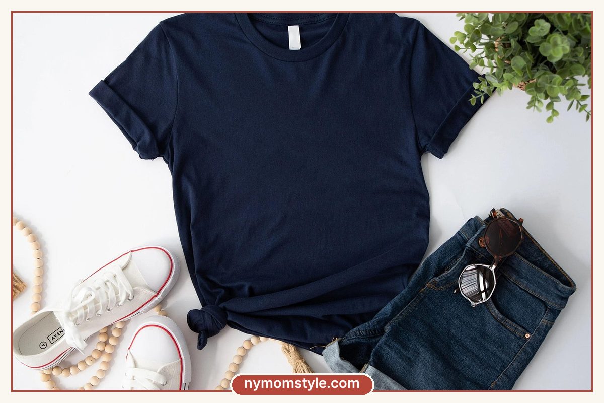
Navy is gentler than black and goes with almost everything. Pair it with cream, white and camel, then add a red or burgundy accent. It works well for jeans, trench coats and striped tees.
Palette 2: Soft and warm
Camel, cream and tan feel soft and expensive. Add rust, olive or a deep green for accents. This palette suits knits, cardigans and soft trousers.
Palette 3: City black
Black with grey and white is practical and easy to care for. Keep it from feeling heavy by adding texture, such as a ribbed knit or a leather bag, and one bright accessory.
Palette 4: Fresh and light
Denim blue and white feel relaxed and crisp. Add blush, sage or yellow for warm weather. Pale colours show stains, so choose washable fabrics.
Palette 5: Earth tones
Olive, tan and terracotta have a natural, calm feel. They suit soft cotton, linen and corduroy, and work well with brown leather shoes.
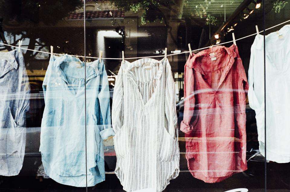
How to choose a palette that suits you
- Look at what you already wear. Which colours appear most in photos where you feel good?
- Check your skin tone. Hold a cream and a bright white top near your face in daylight. Choose whichever makes your skin look healthier.
- Think about your hair and eyes. Colours that echo them often look harmonious.
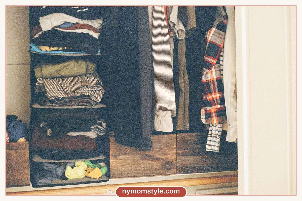
- Consider your life. If you handle sticky hands daily, darker mid-tones hide stains better than white.
- Choose a mood. Do you want to feel calm, sharp or cheerful?
Do not worry about being exact. If a colour makes you feel good, it is a good colour for you.
How to add accent colours safely
- Start small. Use a scarf, a bag or earrings in your accent colour.
- Repeat it. If you wear a rust scarf, add a rust detail elsewhere, such as in a bag or shoes.
- Keep it to one or two accents at a time, so the outfit looks planned.
- Try patterns that include your colours, such as a striped tee with navy and cream.
- Test before you buy. Hold the new piece against three things you own.
Prints and patterns in a neutral capsule
A neutral capsule can include patterns. Stripes, small checks and subtle florals work well if their colours match your palette. One patterned piece in an outfit is usually enough. Pair it with solid pieces so the outfit stays calm.
Practical colour tips for moms
- Dark and mid-tone bottoms hide stains better than pale ones.
- White tops are fine if you can wash them often. Cream and light grey are more forgiving.
- Patterns and heathered fabrics hide crumbs and small marks.
- Wash colours together in cold water so they stay rich.
- Replace faded black with a new pair. Faded basics make the whole outfit look tired.
For more help building the full wardrobe around your palette, read how to build a capsule wardrobe for moms, and for a smaller start, the 10-piece capsule wardrobe. For a different take on simple closets, see minimalist wardrobe essentials.
FAQ
What are the best neutral colours for a capsule wardrobe?
Navy, black, grey, cream, camel and denim blue are the most flexible. Choose two or three, then add one accent.
Can I mix black and navy?
Yes, if you do it on purpose. Keep the shades clearly different, for example a black top with navy jeans, and avoid wearing almost-identical dark tones together.
Is white a good capsule colour for moms?
It can be. Choose thicker fabrics that are not see-through and wash them often. Cream is easier to maintain.
How many colours should my capsule have?
Most capsules work well with two or three neutrals and one or two accents. More than that makes mixing harder.
How do I test a new colour?
Hold it up to your face in daylight and compare it to three pieces you own. If it makes your skin look good and goes with all three, it is a safe choice.
Final thought
Pick one palette, give it a few weeks and let it simplify your mornings. You can always change your accent colour next season, and your neutrals will keep working.